LOGO MDT

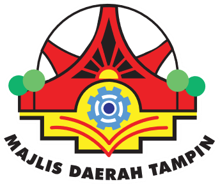
The Logo represents the Tampin District Council combined function through uniquely design elements. Identity of “House of Minangkabau” is showed and using a simple state design.
Design
- A tier red line underneath represent Council functions in preparing and maintaining basic infrastructures.
- The main tower of Minangkabau building which is in the middle represent Council function in planning, controlling and approving all private sector projects.
- The support Tower on left and right side near a circle represent Council function in maintenance works including of recreational, sports and park facility.
- Structure fraction in front of the tower represent Council function in processing all development plans as suggested.
- The greenery of small tress on left and right side with a few small circles in the middle represent Council function in delivering health and cleaning services and also protection the environment.
- A symbol of overlapping books and red engineering wheel in the middle represent Council function in assessing property holdings in administration area and enforcement.
Color
The colors used are green, blue, yellow, white and red. The composition color showed the intention of Council in the enforcement besides the environmentally friendly, activities, certain and trust by officers and staffs highly committed in responsibility under his control.


